- If you ask people to name colors long enough, they go totally crazy.
- "Puke" and "vomit" are totally real colors.
- Colorblind people are more likely than non-colorblind people to type "fuck this" (or some variant) and quit in frustration.
- Indigo was totally just added to the rainbow so it would have 7 colors and make that "ROY G. BIV" acronym work, just like you always suspected. It should really be ROY GBP, with maybe a C or T thrown in there between G and B depending how the spectrum was converted to RGB.
- Nobody can spell "fuchsia".
- Lastly here are some assorted things people came up with while labeling colors: assorted color names
Yes, our human ability to perceive different kinds of colors - even if we can't really name or spell some of them - is indeed a marvelous thing to ponder on. Most of us are aware that colors can elicit certain feelings, thoughts or behaviors: red for sexual readiness, blue for a calm atmosphere, green for environmental awareness, and so on and so forth. Many researches have already shown that color has an effect on people's well-being, and along with lighting, the two factors come together to create an atmosphere that can have an impact on people's perceptions and responses to the environment.
In Dalke et al's work entitled Color and Lighting in Hopsital Design, they reported that different color and lighting schemes are essential details on a hospital's visual environment. Different lighting and color design schemes have an effect on patient's recovery rates, improve the quality and overall experience of patients, staff and visitors, and promote a sense of well-being and independence. They are also powerful tools for coding, navigation and wayfinding.
Sharing: Just today, I attended a tour of a particular medical hospital and saw how they efficiently used colors as markers for many things. Using colors, one can navigate among the different department floors, plus colors are used to distinguish students among nurses. I believe it's a good system.
The aim of Dalke's project is to provide evidence-based research results on color and lighting in the hospital setting. One may call this research a "handbook" for would-be health care professionals or businessmen who'd want to improve or create their own hospital facilities. As their method, they audited 20 general, medium to large hospitals throughout England. They focused on finding out the important issues on key color and lighting schemes on the overall hospital experience as described by patients, staff and visitors.
What did they find out? Well many. But I think I'll just describe some of them:
Cool colors such as these types are believe to be calming which promotes relaxation as well as aid sleeping.

Sculpture, artwork and other landmarks can be useful visual cues in a wayfinding scheme.
A well-lit and well-designed working environment can aid recruitment and retention of staff as well as generally improving morale.
Colour coding requires knowledgeable implementation and is best used for very simple zoning.
Colour coding should be obvious and easy for all visitors to recognize and use under all circumstances. But there should be no possibility of misunderstanding which are the coding colors.
Floor colour coding is useful for older and visually impaired people; this strategy at Poole hospital helped to reduce wall damage by alerting the staff steering trolleys of the nearness of walls.
Glossy floors can be confusing and cause major glare problems for older and visually impaired people.
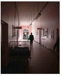
Vision adaptation slows with aging and visual impairment. This corridor changes from extremely bright light to dim conditions without adequate lighting to aid the transfer.
Blue linen is often used in dermatology wards to minimise the distressing appearance of the orange treatment ointments on sheets for the patients.
Although blue is popular and effective the overuse of certain blues and greens in mental healthcare environments has been reported as exacerbating depression and creating an institutional feel for staff and service users
Fully saturated colour without any other contrasts can be desensitizing and visually overpowering. Strong colour should be balanced with other key colors.
These pictures are just tidbits of a vast array of information they presented in their research paper. It's very interesting realize how colors have an important role on ergonomics and health, to a certain extent, I guess. The next time I visit another medical school or hospital, I'll probably take note of the color scheme they used. Probably with enough courage, I'd be able to suggest this handbook to the Medical Directors.
Source:
Dalke, H., Little, J., Neimann, E., Camgoz, N., Steadman, G., Hill, S. & Stott, L. (2006). Colour and lighting in hospital design. Optics & Laser Technology. 38, 343-365.
Source:
Dalke, H., Little, J., Neimann, E., Camgoz, N., Steadman, G., Hill, S. & Stott, L. (2006). Colour and lighting in hospital design. Optics & Laser Technology. 38, 343-365.


No comments:
Post a Comment